Dyn, Inc.
“The phone book of the internet” by engineers, for engineers.
Acquired by Oracle Cloud in 2017.
Scroll ↓Dyn dashboard
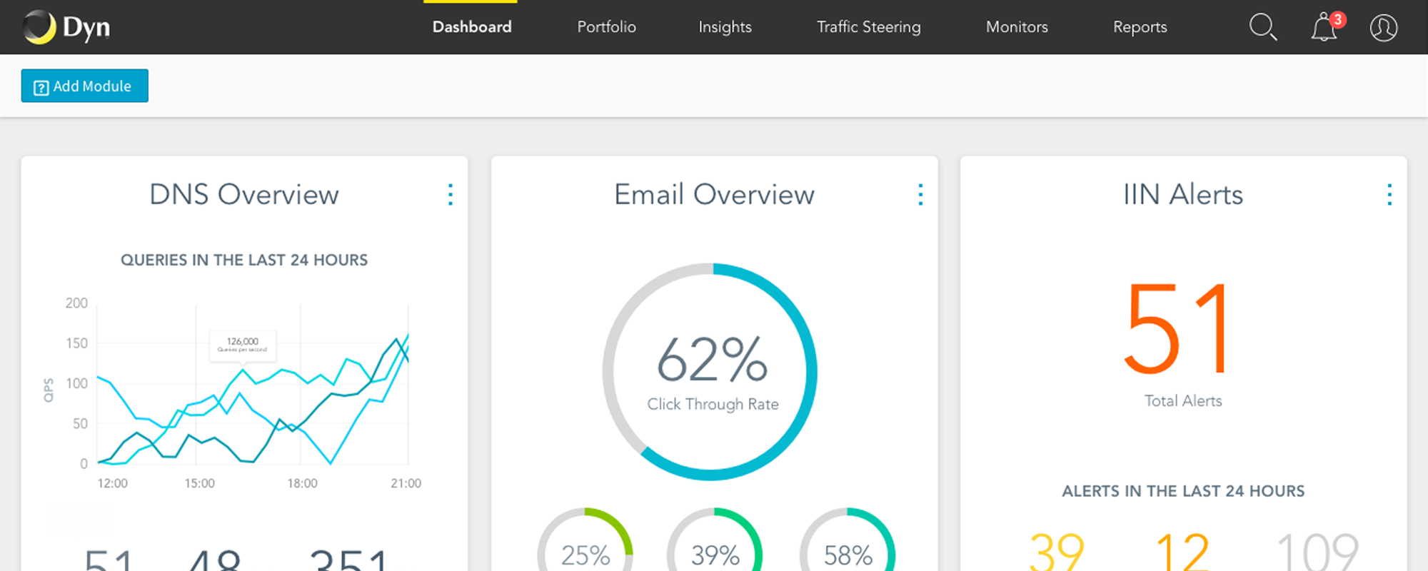
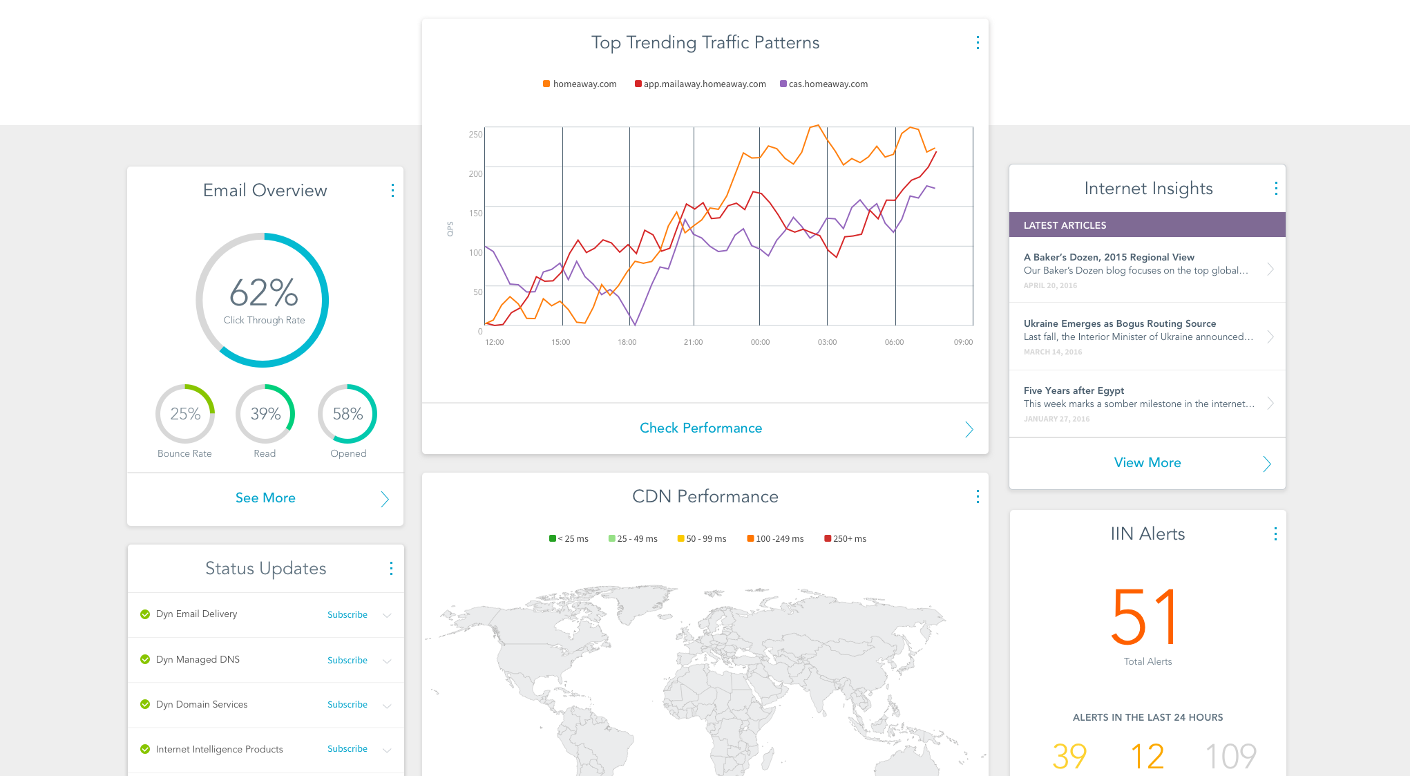
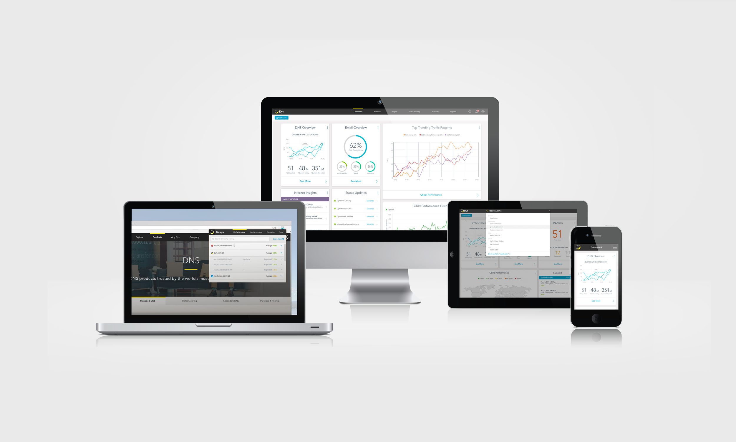
USER EXPERIENCE • PRODUCT DESIGN • USER TESTING • VISUAL DESIGNAn arising platform play meant a brand new dashboard experience for our customers. Merging our three main products into one platform, customers could discover new features, respond to alerts in real time and explore the vast amount of data collected by Dyn in useful and meaningful ways. Coming together from all points of the business—design, sales engineering, product management, engineering and customer success, we developed a dashboard with capabilities and uses our customers had never seen, creating an intersection of features that drove value and growth for the business. Designed & launched in 2016.
Actionable
Despite the technical challenges with legacy APIs, it was our job as a team to comb through the data and find valuable insights behind the noise. Being able to customize an individual dashboard, move components, and take action right on the screen were all high on the priority list, and with each iteration we worked with customers to validate and improve the design.
Customizable, and anything but static—users could make their dashboards fit their individual needs, and the business could drive growth and adoption with increased visibility into features users never knew they could have.
User-centric
Customer voice was essential in designing the dashboard. Product management, sales engineers, customer success advocates and actual customers all provided the same feedback: they wanted visibility into real time data that they could act on.
Navigation
Using A/B and click testing, we compared horizontal and vertical navigations with and without icons. Surprisingly, there was a preference toward the vertical navigation pattern—but the horizontal simplified menu without icons performed better in click tests. We opted for the simplicity of the horizontal navigation, aiming to reduce confusion with a strong hierarchy—and a pattern that could be repeated across all channels and reduce development time and complications.
Search
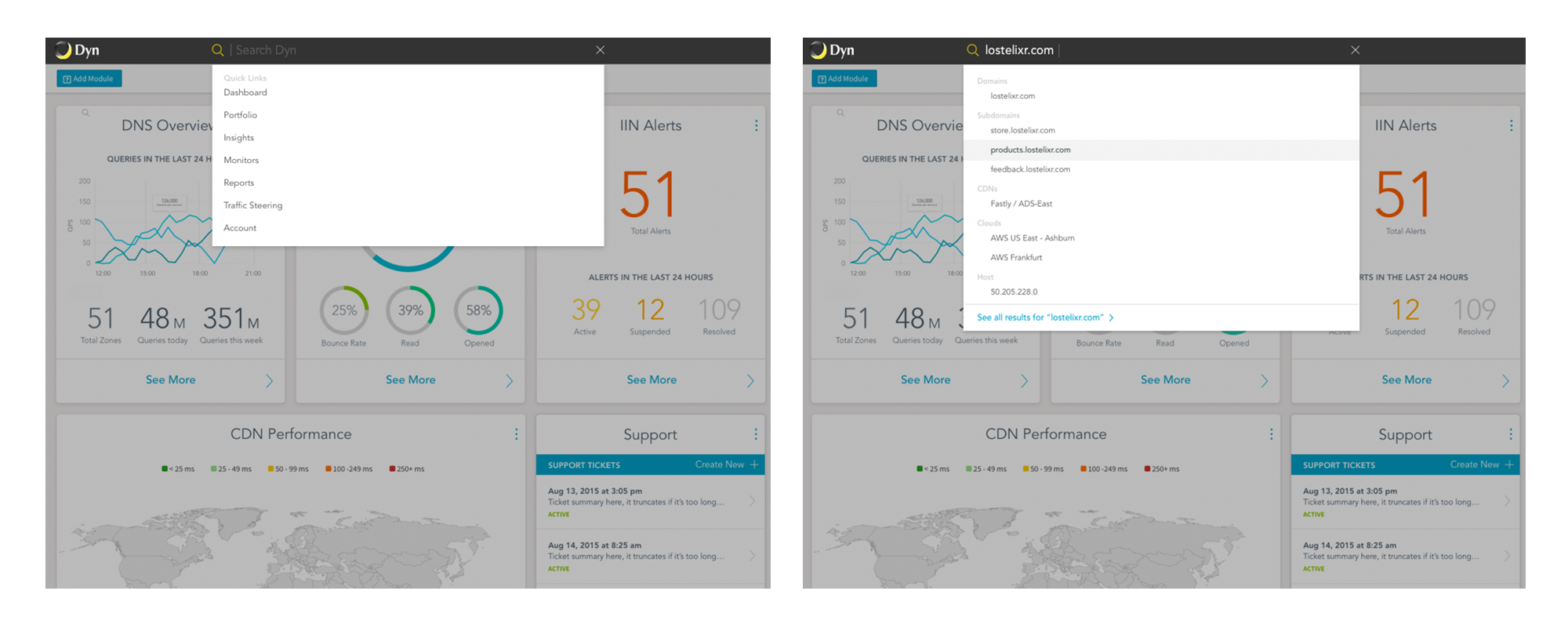
Integrating global search into the main navigation allowed users to find assets without friction on any device. A single click of the prominently displayed search icon would animate the search bar and display “Quick links” of popular search terms and products as well as hint text. Upon beginning to type a query, autocomplete would help guide the user along desirable paths and search terms. Categorized results and a “See all results” page created our optimal search experience.
Gauge: Chrome extension
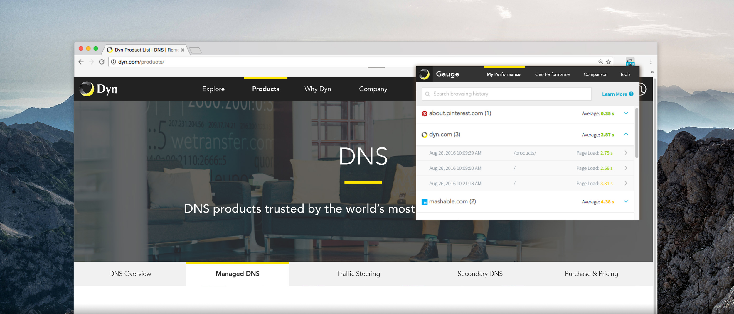
CREATIVE DIRECTION • USER EXPERIENCE • PRODUCT DESIGN • EMAIL • COPYWRITINGOur first ever chrome extension provided a free way to test personal internet performance from your browser. It was a pet project, born from an innovative product manager and software engineer who liked to problem solve. A small spark turned into a mini tech phenomenon.
Within a month, it landed on Gizmodo's "Most useful chrome extensions ever made" list.
This project proved for our tiny team of rebels that following your passion leads to amazing things. Designed & launched in 2017.
Evolution of a UI
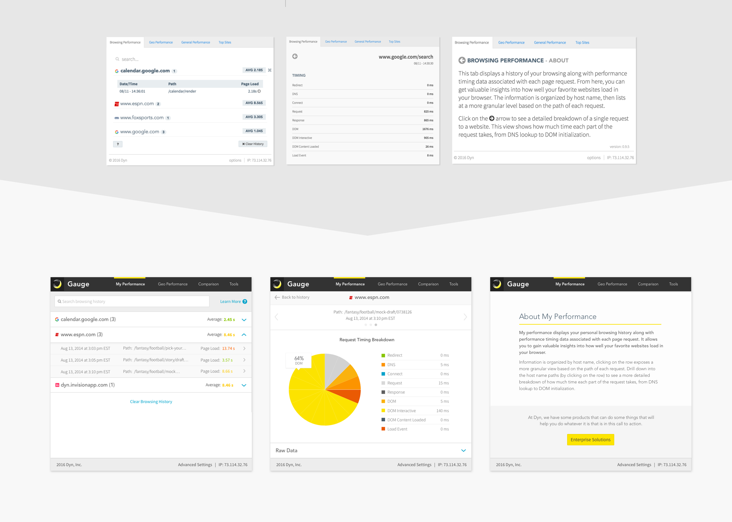
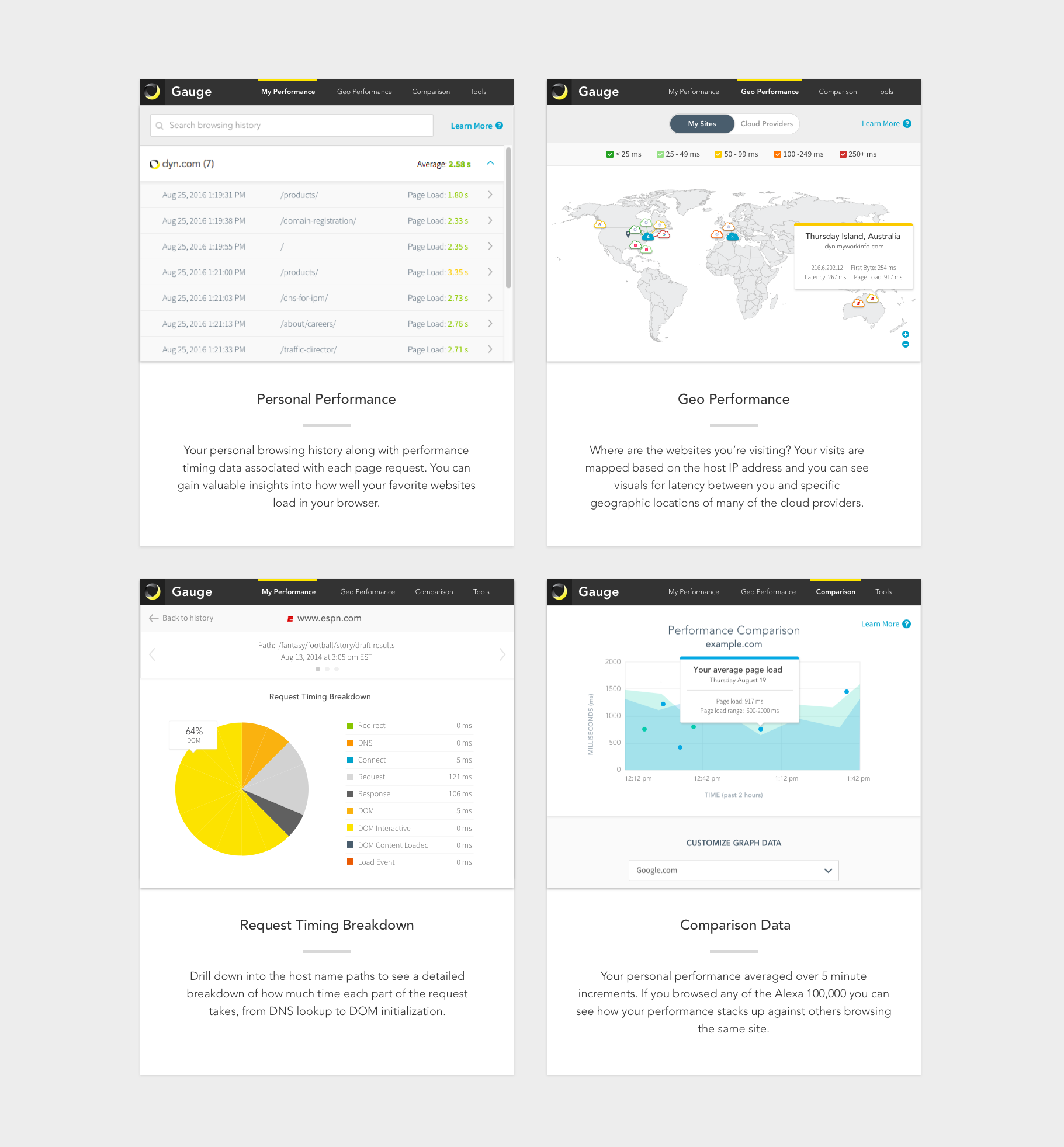
Gauge had been developed in a start-up bootstrap fashion, and needed to not only look like it came from Dyn, but to work for the average internet geek. With every tweak we made in the UI and flow, the experience exponentially improved—like adding gasoline to a fire. Gauge was the first of Dyn's UIs to take on the new style that bridged the gap between marketing and product.
The team had an open mind and valued experience over all else, so reworking the UI and some of the navigation patterns was in the effort budget. As the first deployed test of our new UI patterns and identity (formulated to create a seamless experience from marketing to product), our Chrome extension became the most forward-thinking and unified experiences we had ever put out into the universe.
The idea was simple: Find out what users need, why they would want to download Gauge and give them those features up front. We gathered feedback, integrated our findings in our UI on a regular basis.
